Reimagining talent programme branding for a global insurer through bold, cohesive design
Design Case Study | #professional-services
Context & challenges
A longstanding client approached us to rebrand two existing talent programmes that we had delivered in tandem for several years, aiming to better suit their target audiences and updated programme naming.
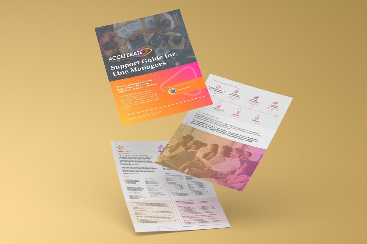
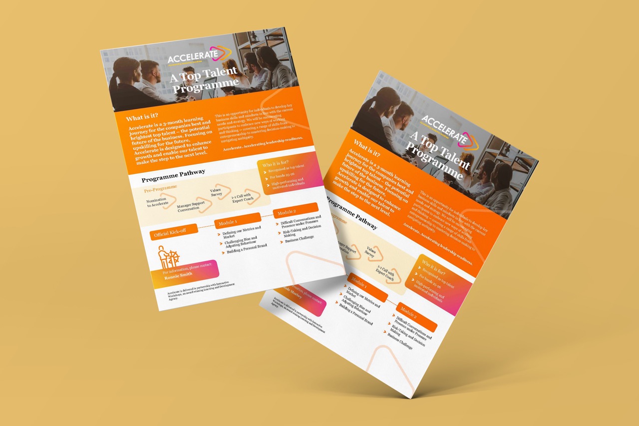
As an organisation at the forefront of their industry, it was crucial that the new brands were professional, sleek, and visually cohesive. The challenge: revamping the visual approach across the entire collection of assets to meet this brief, whilst preserving the overall flow and core message behind each piece of learning.
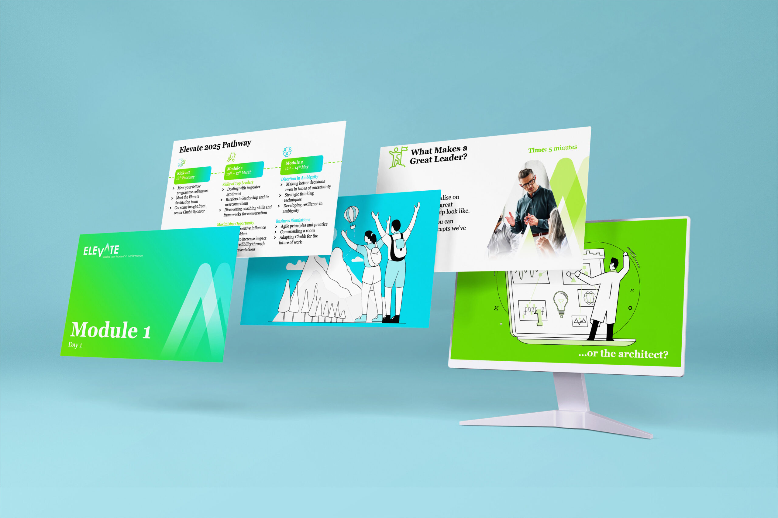
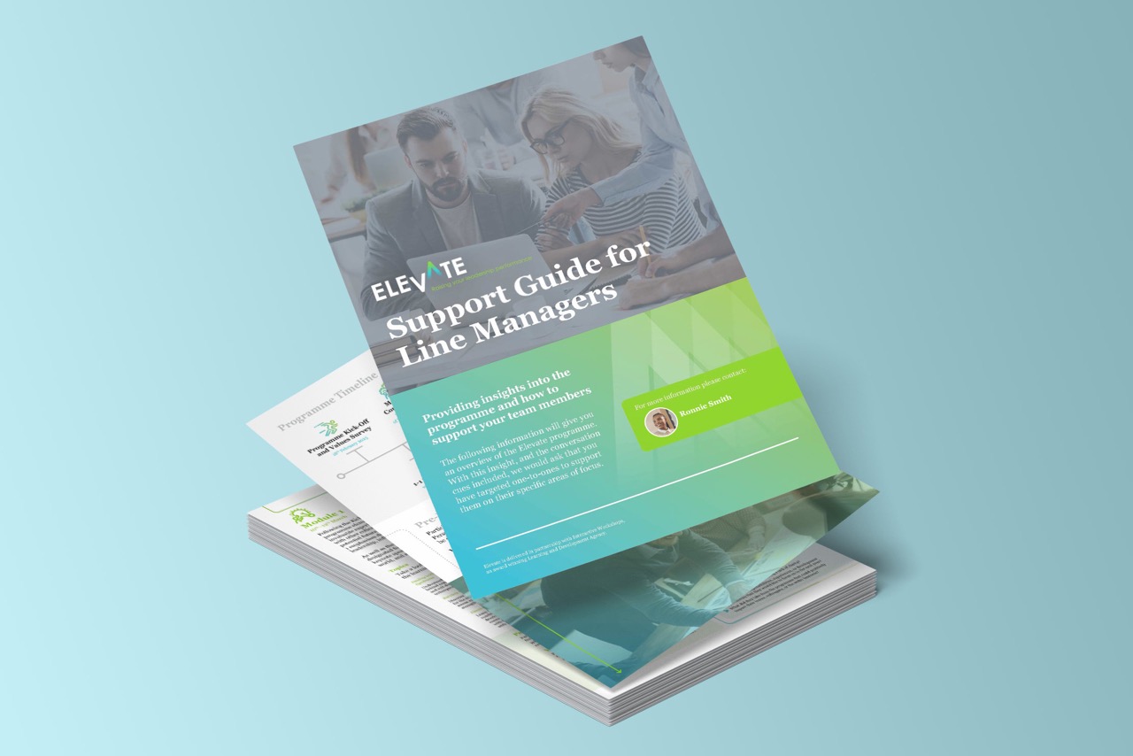
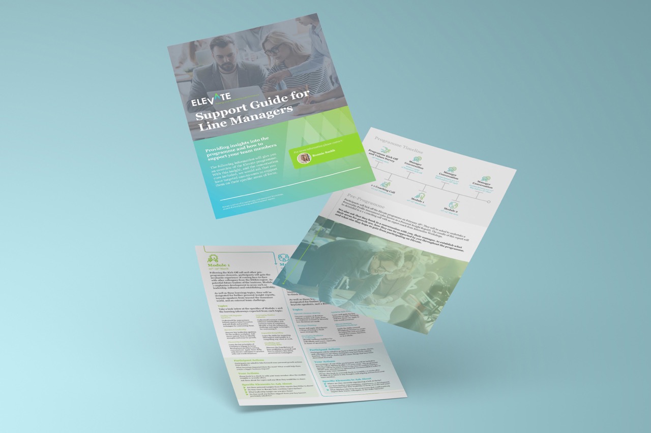
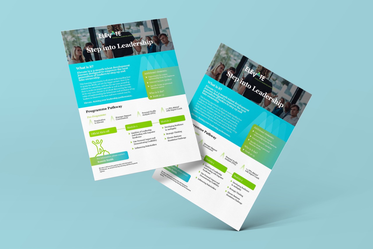
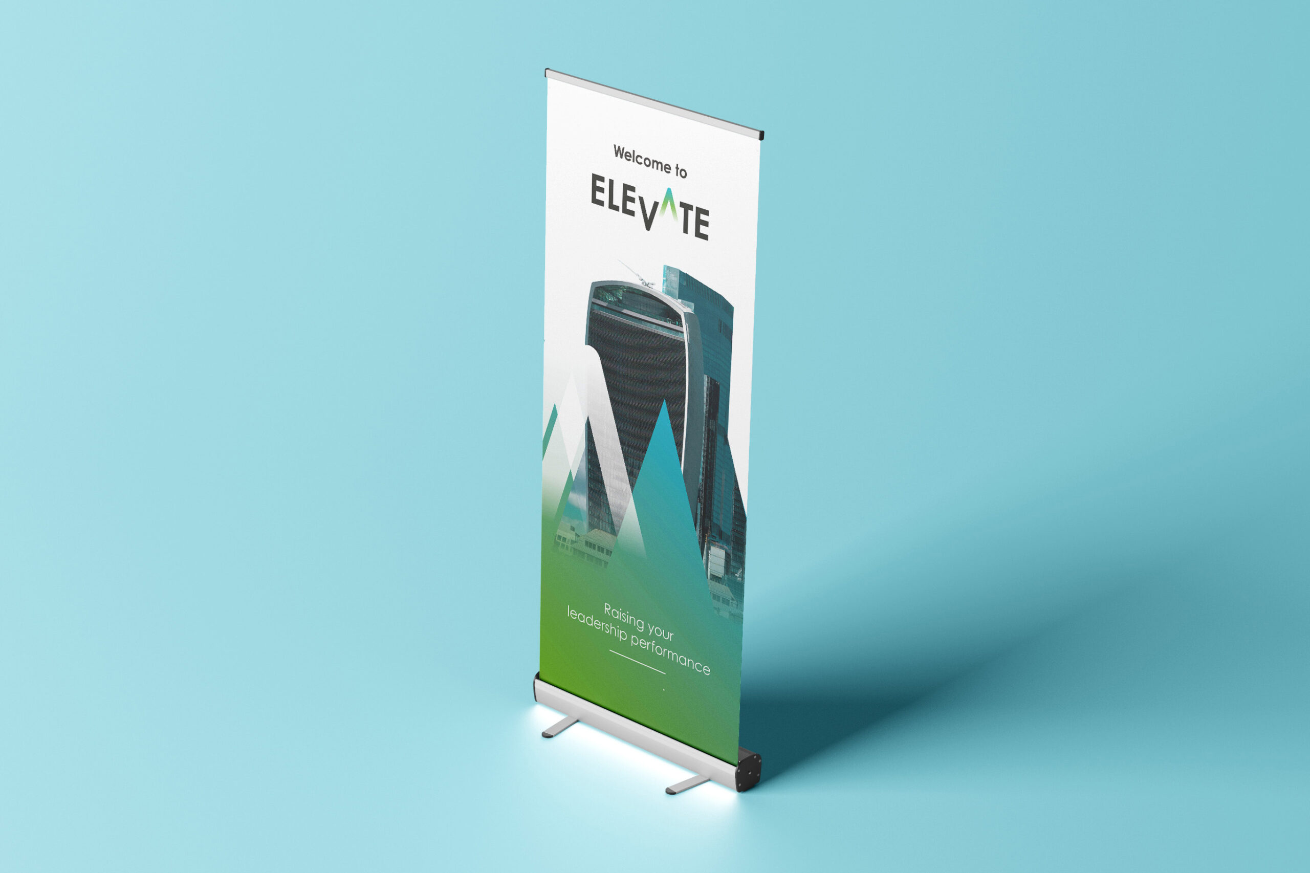
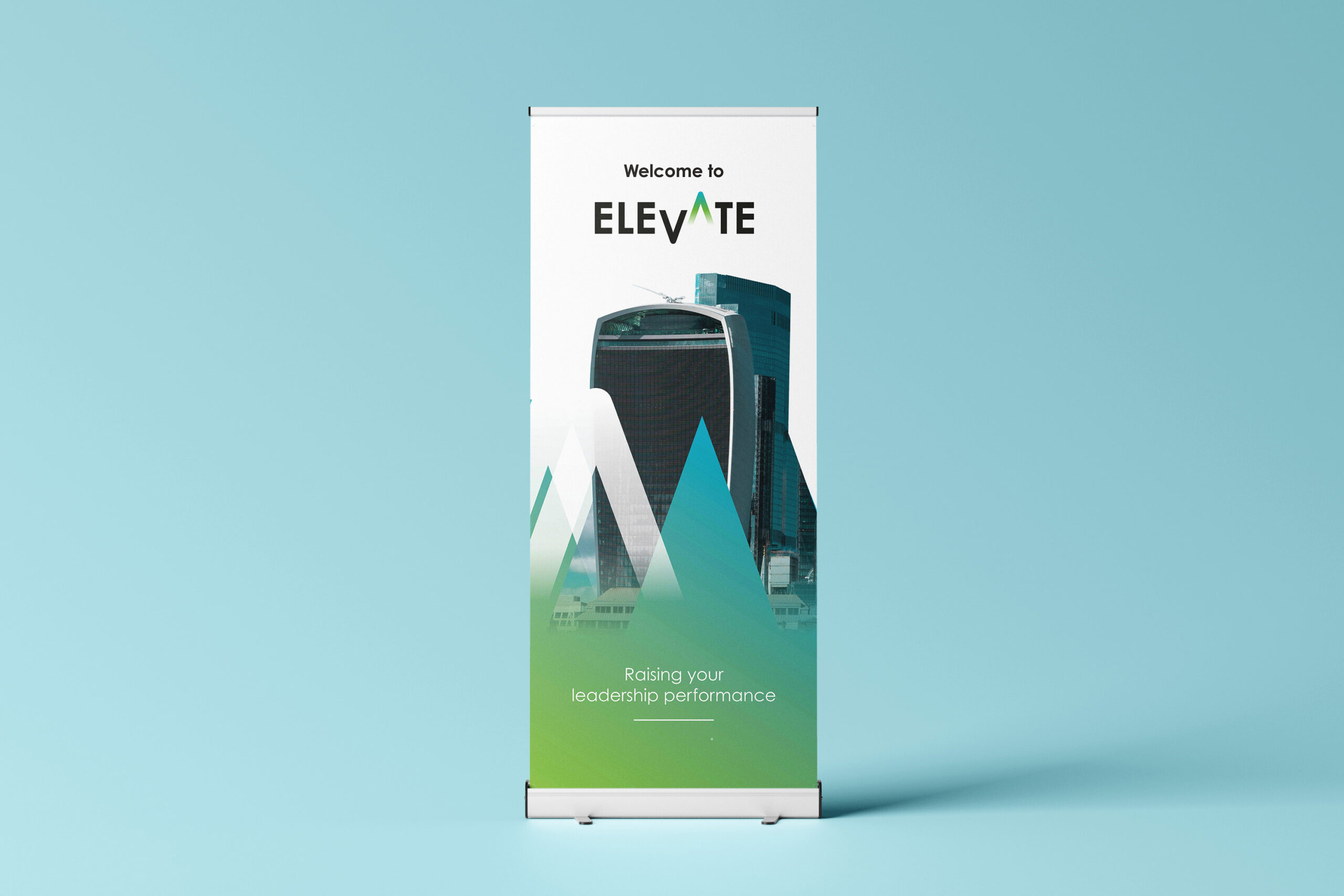
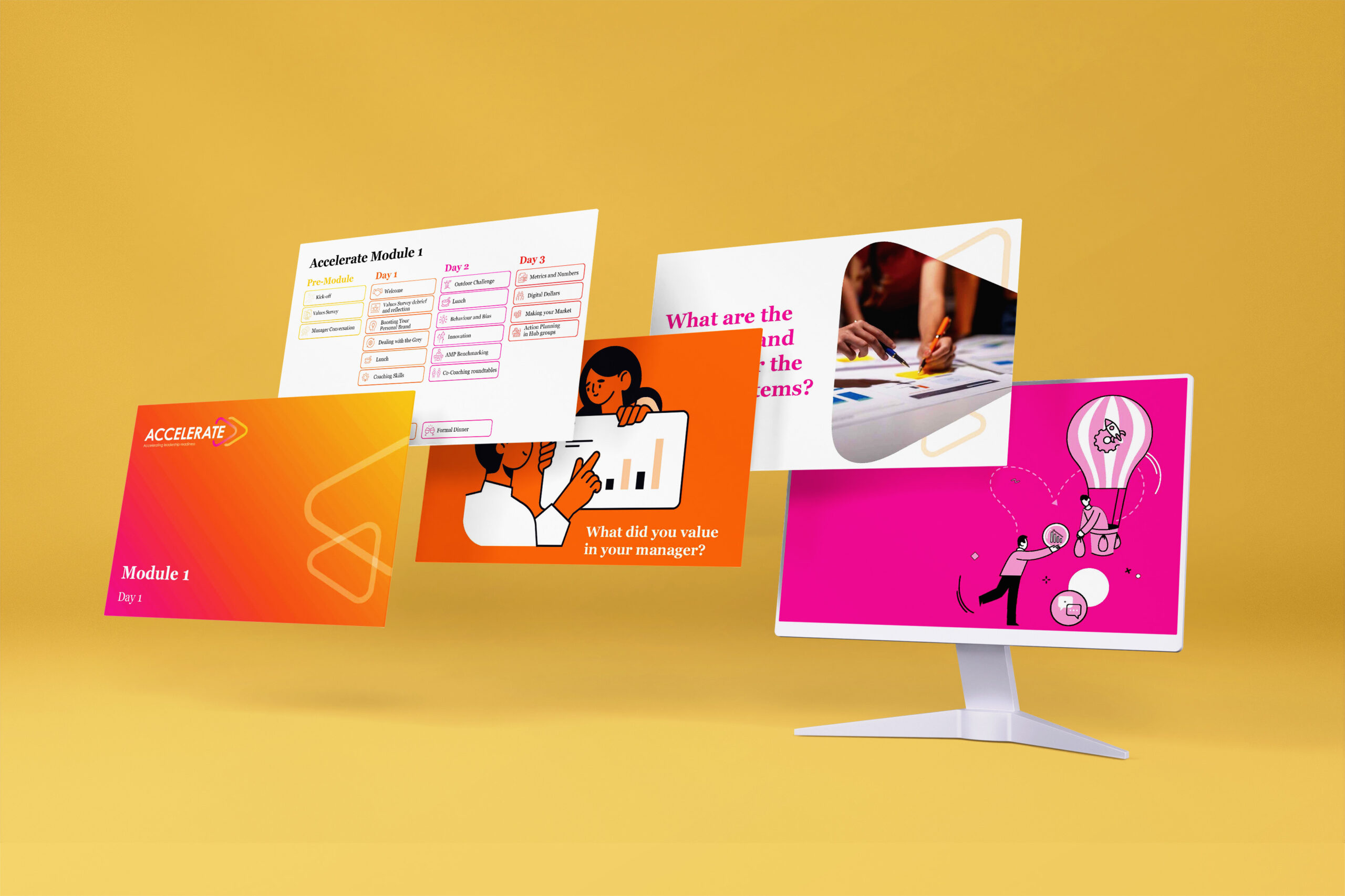
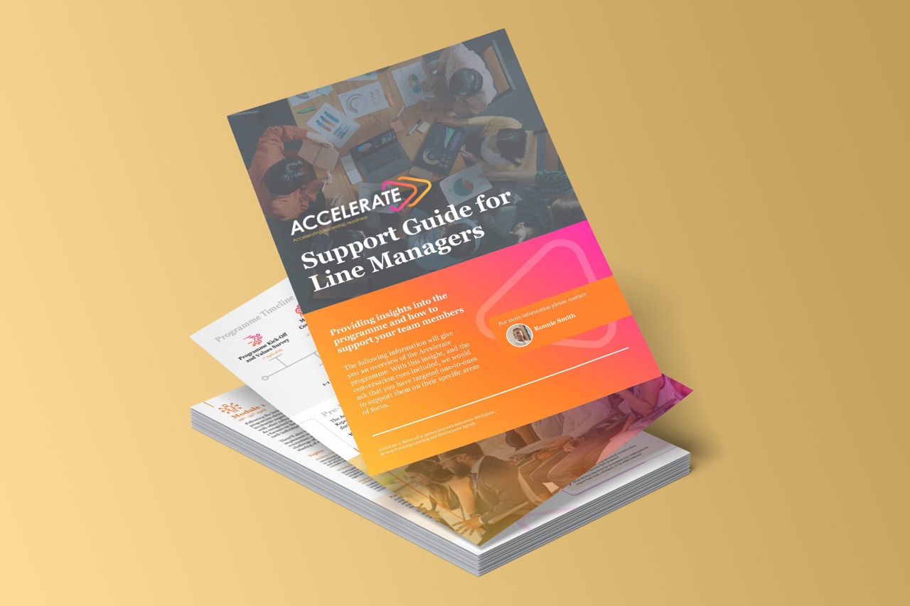
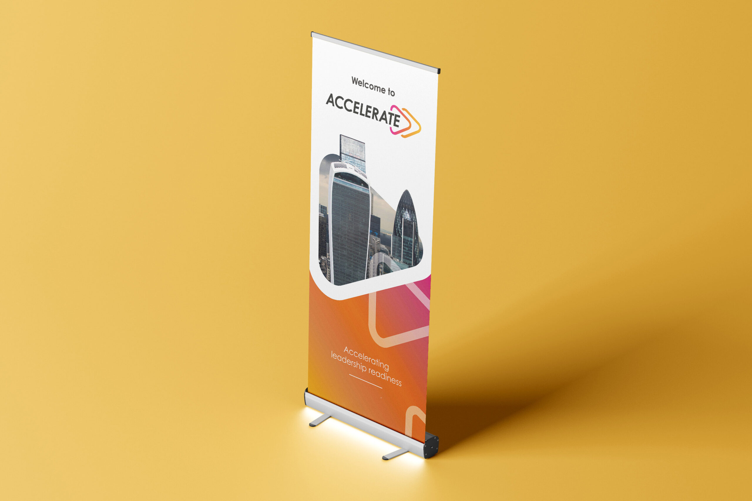
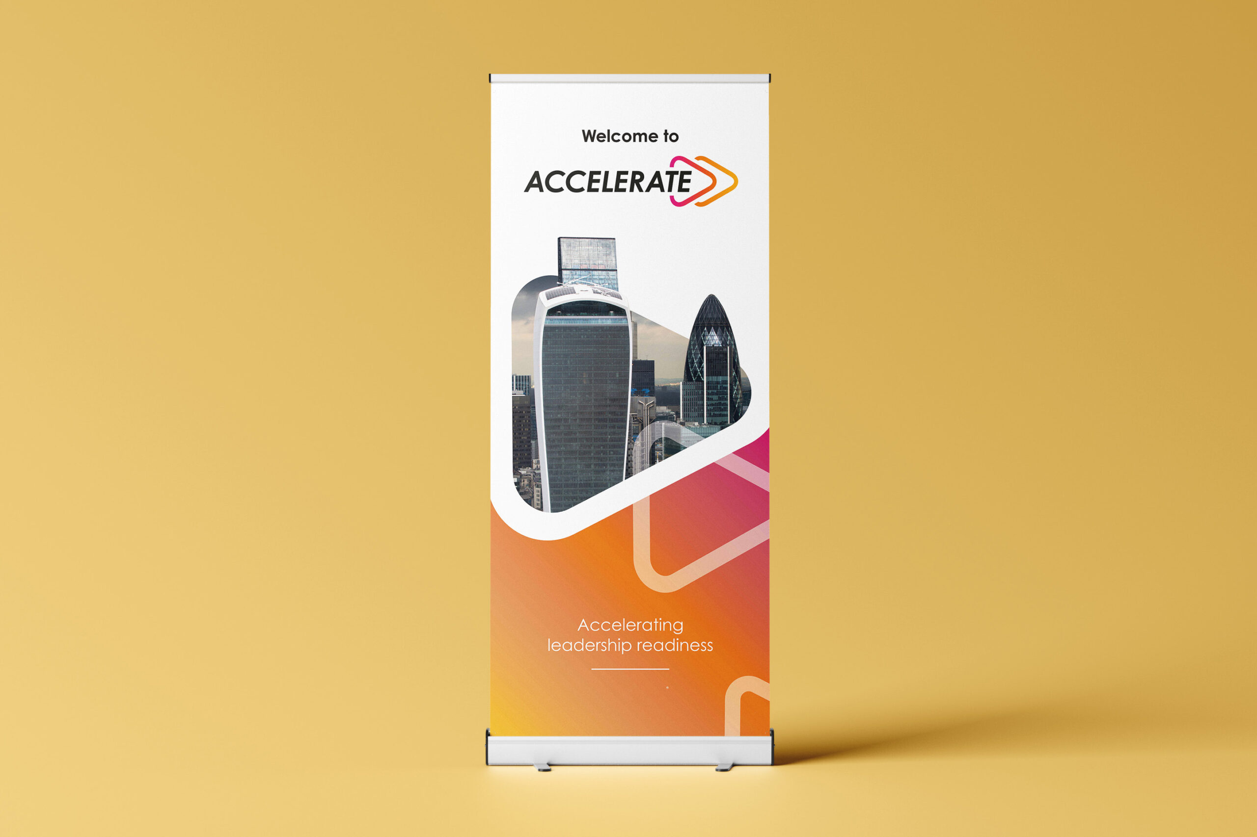
Our task was to reimagine logos, email banners, notebooks, decks, brochures, stickers, marketing materials, and more — all from scratch — whilst maintaining the red thread, all in a few months.


Solution
We began by reconceptualising key brand elements — colour schemes, major motifs, and fonts. The key challenge, however, was to create two unique visual identities that still fit under the organisational brand guidelines — this wasn’t the time to go wild with conceptualising ideas.
These laid the foundation for a new visual identity. This process considered newly developed programme names and the overall effect our client wanted each to have: to drive engagement and inspire participants by emphasising the potential impact of both programmes.
With that in mind, we curated two bright colour palettes, designed paired arrow motifs, and developed clean font usage guidelines to begin redesigning the collection of 50 assets.
The materials turned out beautifully. They were clear, bold, sleek, and cohesive. Though the programmes operated independently, their connection and joint impact was instantly recognisable through the branding alone — which was exactly the goal.
Results
Re-designing these materials was about more than simply refreshing assets after a few years. It was about sparking inspiration and enriching development.
The re-vamped assets not only elevated the profile of the organisation’s talent pathways but also inspired participants to get excited about them. The revised assets also act as a visual mirror of the professionalism that the programmes draw out of participants. It turns out that even long-established concepts can be seen in a new light — with the right design, perception can shift in powerful ways.
